Tampilkan postingan dengan label User interface. Tampilkan semua postingan

The New Google Maps Replaces the Classic Interface

Posted by Unknown Jumat, 21 Februari 2014 0 komentar
Last year, Google released a completely new Google Maps interface for desktop, but made it opt-in. Since then, the Google Maps team fixed bugs, improved performance and added some of the missing features (Pegman, My Location, short URLs, multi-point directions). The next step is obvious: the new Google Maps will become the default version.

"Over the coming weeks, the new Google Maps will make its way onto desktops around the world. Many of you have been previewing it since its debut last May, and thanks to your helpful feedback we're ready to make the new Maps even more widely available," informs Google.

The new Google Maps promised to bring an immersive experience, a personalized map that shows what's relevant and helps you make smarter decisions using recommendations from your Google+ circles. It's a simplified interface that's closer to the mobile UI. Google removed some of the features from the classic interface and focused on the basics: a map you're encouraged to explore, unified directions that show the best options, instant search, permalinks, panoramic images, Google Earth and Street View without plugins.


Classic Google Maps is still available: you can switch by clicking the "?" icon at the bottom of the page and selecting "Return to classic Google Maps". You'll see this message: "You have switched back to classic Google Maps for this session. Remember this choice for next time?". Click "Yes" to always go to the old interface when visiting Google Maps.


Baca Selengkapnya ....

YouTube Has a New Interface

Posted by Unknown 0 komentar
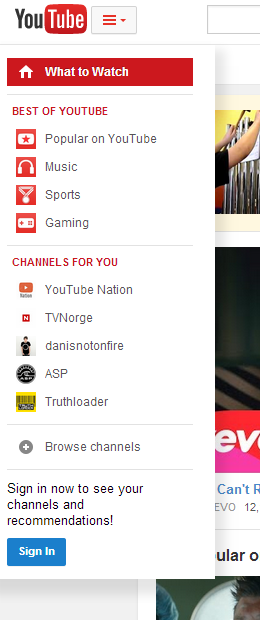
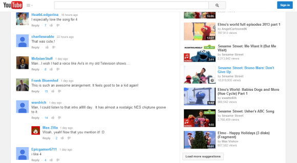
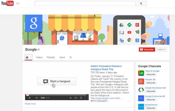
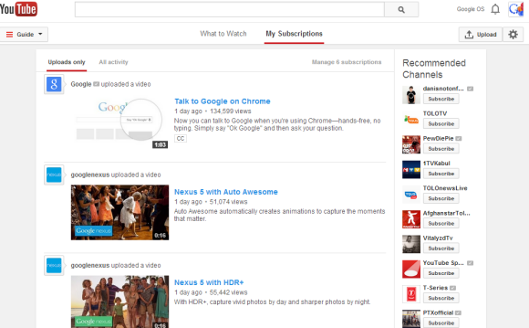
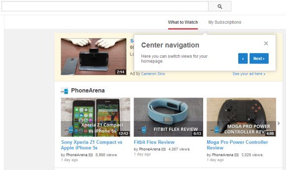
After many months of experiments, YouTube's new interface is finally available to everyone. The layout is center aligned, the header is sticky, the guide sidebar is now a "hamburger"-style menu that includes your playlists, subscriptions and more.

"YouTube now has a center-aligned look, fitting neatly on any screen size, and feeling similar to the mobile apps you're spending almost half your YouTube time with. You can quickly flip between what's recommended and popular in 'What to Watch' like Postmodern Jukebox's Timber, and the latest from your subscribed channels like iamOTHER in 'My Subscriptions,' with both options now front and center. Click the guide icon to the right of the YouTube logo at any time to see your playlists, subscriptions and more."


You can also check some screenshots from YouTube's experiments: July, September, October, November.

Baca Selengkapnya ....

YouTube Tests New Mobile Site UI

Posted by Unknown Sabtu, 08 Februari 2014 0 komentar
YouTube tests a new interface of the mobile site. It's closer to the mobile app UI, it shows the description and the number of likes and dislikes, a red "subscribe" button and action buttons are placed below the video.


There are other changes: the new YouTube logo, the "hamburger" menu, bigger thumbnails, new font, gray background.


{ Thanks, Nedas. }

Baca Selengkapnya ....

YouTube's Center-Aligned UI, Ready For Launch

Posted by Unknown Jumat, 31 Januari 2014 0 komentar
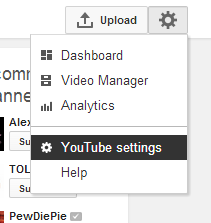
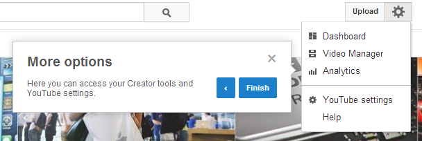
YouTube continues to refine its center-aligned experimental interface, first spotted in July. The latest tweaks include a menu button placed next to the YouTube logo, a gear button placed next to the "upload" button and a sidebar that remembers the latest display state.


Just like in the previous iterations, the header is sticky and the layout is center-aligned.


The homepage uses carousels and shows contextual menus that let you customize the sections.


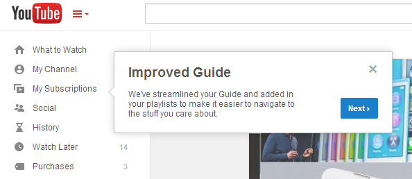
YouTube also shows a tour guide, which means that the updated interface is almost ready to be released for everyone.


Here's how you can enable the experimental interface. If you use Chrome, Firefox, Opera, Safari or Internet Explorer 8+:

1. open youtube.com in a new tab

2. load your browser's developer console:

* Chrome or Opera 15+ - press Ctrl+Shift+J for Windows/Linux/ChromeOS or Command-Option-J for Mac

* Firefox - press Ctrl+Shift+K for Windows/Linux or Command-Option-K for Mac

* Internet Explorer 8+ - press F12 and select the "Console" tab

* Safari 6+ - if you haven't enabled the Develop menu, open Preferences from the Safari menu, go to the Advanced tab and check "Show Develop menu in menu bar". Close Preferences and then press Command-Option-C to show the console.

* Opera 12 - press Ctrl+Shift+I for Windows/Linux or Command-Option-I for Mac, then click "Console".

3. paste the following code which changes a YouTube cookie:

document.cookie="VISITOR_INFO1_LIVE=LlWIQlLwL_Y; path=/; domain=.youtube.com";window.location.reload();

4. press Enter and close the console.

To go back to the regular interface, use the same instructions, but replace the code from step 3 with this one:

document.cookie="VISITOR_INFO1_LIVE=; path=/; domain=.youtube.com";window.location.reload();

{ Thanks, Rubén. }

Baca Selengkapnya ....

Circular Profile Pictures in Google's Navigation Bar

Posted by Unknown Jumat, 10 Januari 2014 0 komentar
Google no longer shows the square profile image in the navigation bar. Now it shows a round image, just like in Google+.


The new version looks nice and makes the Google bar more consistent. Some Google services still use the old version: YouTube, Blogger.


{ Thanks, Florian K. }

Baca Selengkapnya ....

Updated Google Settings Page

Posted by Unknown Kamis, 12 Desember 2013 0 komentar
The Google Settings page has received a major makeover and switched to the card interface that's used in many Google services and apps. The page is more compact, better optimized for mobile devices and only focuses on the most important features. Advanced features like Google Dashboard or Takeout are linked from the "data tools" section. Google+ settings are available if you click "edit notification settings" and this page also has a new interface.


The security section lets you change your password and recovery options.


The language section lets you skip translations for one or more languages and also enable input tools.


While the new interface looks nice, I feel that there are too many links that send you to separate pages and the transition is not smooth. Here's an example for Google Takeout, which shows a "Data Tools" link that sends you back to the Google Settings page:


{ Thanks, Emanuele, JD, Jérôme. }

Baca Selengkapnya ....

YouTube Tweaks Experimental Center-Aligned UI

Posted by Unknown Rabu, 27 November 2013 0 komentar
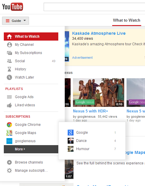
YouTube continues to tweak the center-aligned UI experiment. The latest version includes a new upload button, a refined guide sidebar with new icons and "more" drop-downs for playlists and subscriptions, a list of recommended channels and probably other features.


The "guide" sidebar is displayed by default only if there's enough room. If there isn't, the sidebar is hidden and you need to click "guide" to see your playlists, subscriptions, video history and more.


The layout still uses cards and it's center-aligned.


Here's how you can enable the experimental interface. If you use Chrome, Firefox, Opera, Safari or Internet Explorer 8+:

1. open youtube.com in a new tab

2. load your browser's developer console:

* Chrome or Opera 15+ - press Ctrl+Shift+J for Windows/Linux/ChromeOS or Command-Option-J for Mac

* Firefox - press Ctrl+Shift+K for Windows/Linux or Command-Option-K for Mac

* Internet Explorer 8+ - press F12 and select the "Console" tab

* Safari 6 - if you haven't enabled the Develop menu, open Preferences from the Safari menu, go to the Advanced tab and check "Show Develop menu in menu bar". Close Preferences and then press Command-Option-C to show the console.

* Opera 12 - press Ctrl+Shift+I for Windows/Linux or Command-Option-I for Mac, then click "Console".

3. paste the following code which changes a YouTube cookie:

document.cookie="VISITOR_INFO1_LIVE=rkZGzYxfbLQ; path=/; domain=.youtube.com";window.location.reload();

4. press Enter and close the console.

To go back to the regular interface, use the same instructions, but replace the code from step 3 with this one:

document.cookie="VISITOR_INFO1_LIVE=; path=/; domain=.youtube.com";window.location.reload();

{ Thanks, Florian K. }

Baca Selengkapnya ....

YouTube's Player, Back to Simple Buttons?

Posted by Unknown 0 komentar
Back in September, YouTube's player grouped controls for annotations, player size and video quality. A few weeks ago, the "large player" button has been removed from the drop-down and brought back to its original position, next to the "full screen" button.


If the video doesn't have annotations and you use the Flash player, you'll even see the video quality drop-down without an additional click:


Baca Selengkapnya ....

New Interface for Google's Account Permissions Page

Posted by Unknown 0 komentar
Google's account permissions page has a new interface which does a better job at listing the permissions, shows bigger thumbnails and the date when you authorized a service.

"On the Account Permissions tab of your Google Account, you can see a list of third-party sites and applications. These are sites and applications to which you've granted permission to access your Google Account, and you can see on this list to what parts of your account they have access. For example, you might have downloaded an app that helps you schedule workouts with friends. This application might have requested access to your Google Calendar and Contacts to suggest times and friends for you to meet up with," informs Google's help center.

Google shows your Android and iOS devices at the top of the page. My Nexus 7 tablet was listed 3 times, so I clicked "Revoke access" next to the entries that include: "Inactive - We haven't seen activity from this device for at least 60 days."


If you see some services you no longer use, click "Revoke access". You'll be asked for permission the next time you use them.

{ Thanks, Florian K. }

Baca Selengkapnya ....

New Interface for Google+ Notifications

Posted by Unknown Rabu, 20 November 2013 0 komentar
Google+ notifications have a new interface: there's a "previously read" section, just like in the Google+ app for Android, and there are some new transitions that mimic scrolling down.

The previously read notifications are no longer displayed below the Jingles icon, so you need to click "previously read" to see them. The notifications box is less cluttered and you can still read all your notifications.


Here's a GIF that shows some of the new animations:


{ Thanks, Mukil. }

Baca Selengkapnya ....

YouTube Tests Channel Cards

Posted by Unknown Minggu, 17 November 2013 0 komentar
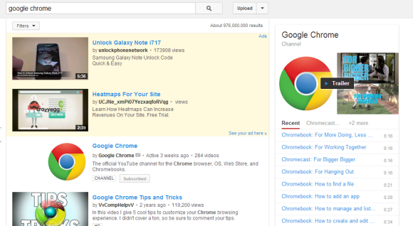
After adding music cards and testing cards for shows, YouTube experiments with cards for channels. They're displayed in the right sidebar of the search results page and show the latest videos from the channel and some of its playlists.

Here's an example for Google Chrome. The channel is still included in the list of search results.


Here's how you can enable the experimental feature. If you use Chrome, Firefox, Opera, Safari or Internet Explorer 8+:

1. open youtube.com in a new tab

2. load your browser's developer console:

* Chrome or Opera 15+ - press Ctrl+Shift+J for Windows/Linux/ChromeOS or Command-Option-J for Mac

* Firefox - press Ctrl+Shift+K for Windows/Linux or Command-Option-K for Mac

* Internet Explorer 8+ - press F12 and select the "Console" tab

* Safari 6 - if you haven't enabled the Develop menu, open Preferences from the Safari menu, go to the Advanced tab and check "Show Develop menu in menu bar". Close Preferences and then press Command-Option-C to show the console.

* Opera 12 - press Ctrl+Shift+I for Windows/Linux or Command-Option-I for Mac, then click "Console".

3. paste the following code which changes a YouTube cookie:

document.cookie="VISITOR_INFO1_LIVE=2IS0PWox26Q; path=/; domain=.youtube.com";window.location.reload();

4. press Enter and close the console.

Some examples of searches: [google], [apple], [comedy central].

To go back to the regular interface, use the same instructions, but replace the code from step 3 with this one:

document.cookie="VISITOR_INFO1_LIVE=; path=/; domain=.youtube.com";window.location.reload();

{ via Rubén. }

Baca Selengkapnya ....

Blue YouTube

Posted by Unknown Jumat, 15 November 2013 0 komentar
I like blue, so I was pleasantly surprised to see that YouTube made some UI elements blue (#2793e6): the like button and the line below the number of views. Maybe someone was unhappy that Android KitKat removed all the blue icons and decided to compensate in other ways or maybe it's an attempt to calm YouTube users and make them stop posting silly comments.


Baca Selengkapnya ....
Mobile First

Posted by Unknown 0 komentar
A few years ago, many people complained that mobile sites and mobile apps are too limited. They couldn't include all the features from their desktop counterparts and some thought that was a bad thing.

Fast forward today and you'll notice that Google's desktop sites look more and more like Google's mobile apps. Most Google redesigns are all about taking mobile interfaces and adding them to the desktop. That's one of the reasons why many Google services drop advanced features and opt for simplified interfaces. This way, everything looks consistent and users can quickly switch from the mobile apps to the desktop apps.

Here are some examples:

1. The Google Maps redesign started with the iPhone app, continued with the desktop site and then the Android app.


2. The app launcher from the Google navigation bar was first available in the Google Search app for iOS.


3. Google Play's desktop interface had a lot of advanced features that were removed when Google updated the site to make it look more like the Android app.

4. The Google+ photo editor and Chrome Office editor are based on mobile apps that were ported to Native Client. You're now using the desktop to run mobile apps (only in Chrome).


5. Google Keep for Android has a lot more features than Google Keep for desktop. For example, you can't reorder notes or add more than one image in Google Keep for desktop.


Somehow, the most innovative and most interesting apps are now in the mobile space. That's where the users are moving and where things are constantly changing. Mobile is a flourishing testbed for new ideas.

Baca Selengkapnya ....
Background Color Experiment in Google Mobile Search

Posted by Unknown Selasa, 12 November 2013 0 komentar
Google experiments with a slightly different mobile search interface that has a different background color to emphasize the cards. "In this experiment, they've made the background darker in colour to add more contrast and make the cards stand out more," says Lee Jarratt, who noticed the new interface.


Here's the regular interface:


{ Thanks, Lee. }

Baca Selengkapnya ....

Gmail Tests a New Interface for Attachments

Posted by Unknown 0 komentar
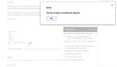
Google tests a new interface for attachments internally. A screenshot from a Google employee reveals a Gmail attachment, followed by "Dogfood confidential - submit feedback on the new attachments experience".


The attachment from the screenshot appears to be an Excel spreadsheet and Gmail shows a thumbnail, the title of the file and an icon that's also used in Google Drive for Excel files. Here's the standard interface:

As you can see, the new Gmail UI uses a different icon and no longer displays options like "View", "Open as a Google spreadsheet" or "Download". It's not clear what happens when you click the attachment, but I assume it sends you to Google Drive, where you can preview the file or download it.

It's likely that Google wants to move Gmail attachments to Google Drive. Now Gmail and Google Drive use shared storage and Google Drive provides better ways to manage, search and share files.

Here's some Google Drive code which suggests that Drive could include some system folders for Gmail attachments and Google Keep notes.


{ Thanks, Florian K. }

Baca Selengkapnya ....

A Google Parameter Brings Back the Black Bar

Posted by Unknown Kamis, 07 November 2013 0 komentar
If you're missing Google's black navigation bar, there's a parameter that brings it back. If you add "?noj=1" or "?noj=0" to a Google search URL, you'll temporarily replace the app launcher with the black bar. Here's the "black bar" version of the Google homepage: http://www.google.com/?noj=1.


This doesn't change the interface permanently and it's not clear for how long it will work. The parameter also disables Google Instant and replaces it with the old Google Suggest.

{ Thanks, Rubén. }

Baca Selengkapnya ....

More Google Experiments That Hide Results URLs

Posted by Unknown Selasa, 22 Oktober 2013 0 komentar
There are at least two other versions of the Google experiment that removes search results URLs. The first alternate version places site names or domain names above the page title. For some results Google shows the site name, for other results Google displays the hostname.


The second alternate version shows both the site name and the hostname.


Which one do you like?

(As a side note, if you want to learn more about URLs, check this article written by Matt Cutts.)

{ Thanks, Rubén. }

Baca Selengkapnya ....

YouTube Cards for Shows

Posted by Unknown Senin, 21 Oktober 2013 0 komentar
YouTube tests a new interface for the shows card that looks just like the music card. It displays a large thumbnail, a list of seasons and episodes when you search for the name of the show.

"A YouTube show is an episodic or consistently themed web series consisting of a cast along with one or various topics, styles, and/or storylines. A viewer can subscribe directly to a show as opposed to an entire channel. All episodes in a show are created by a single partner, organized into seasons and delivered consistently. Episodes may be ad-supported, purchased by rental or not monetized at all," explains YouTube.


Here's the existing interface:


Here's how you can enable the experimental feature. If you use Chrome, Firefox, Opera, Safari or Internet Explorer 8+:

1. open youtube.com in a new tab

2. load your browser's developer console:

* Chrome or Opera 15+ - press Ctrl+Shift+J for Windows/Linux/ChromeOS or Command-Option-J for Mac

* Firefox - press Ctrl+Shift+K for Windows/Linux or Command-Option-K for Mac

* Internet Explorer 8+ - press F12 and select the "Console" tab

* Safari 6 - if you haven't enabled the Develop menu, open Preferences from the Safari menu, go to the Advanced tab and check "Show Develop menu in menu bar". Close Preferences and then press Command-Option-C to show the console.

* Opera 12 - press Ctrl+Shift+I for Windows/Linux or Command-Option-I for Mac, then click "Console".

3. paste the following code which changes a YouTube cookie:

document.cookie="VISITOR_INFO1_LIVE=c1OXNGmJ090; path=/; domain=.youtube.com";window.location.reload();

4. press Enter and close the console.

To go back to the regular interface, use the same instructions, but replace the code from step 3 with this one:

document.cookie="VISITOR_INFO1_LIVE=; path=/; domain=.youtube.com";window.location.reload();

Some examples of searches: [lifehacker], [designers at work], [classical music], [gta].

{ Thanks, Rubén. }

Baca Selengkapnya ....
Trik SEO Terbaru support Online Shop Baju Wanita - Original design by Bamz | Copyright of android populer.